Carla & Tourla: Car Rental Apps
Summary
As a Senior Product Designer at Kasaba Technologies, I improved user experience and conversion rates across platforms serving thousands of users. Using data-driven approaches and user research, I increased conversion rates from 0.5% to 2.5% by reframing offerings, boosted social sharing to 20%, and improved terms and conditions UX while increasing conversions by 5%. I also systematized UI design and refined handoff processes, demonstrating my ability to balance user needs with business goals for measurable product improvements.
As a Senior Product Designer at Kasaba Technologies, I contributed to 2 native iOS apps, 1 native Android app, and a website that serve thousands of users worldwide.
My primary focus areas included UX and UI design, alongside product strategy. I dedicated myself to understanding users and aligning our goals with business needs through user interviews, data analysis, and strategic insights.
Highlights
Turning User Confusion into Conversion: 0.5% → 2.5%
We offer rental cars from top companies to users in locations where no cars are directly available. If a user selects one of these cars, we coordinate with the rental company to deliver it to the user's chosen location.
In the existing variant (A), users saw a logo labeled "Major Suppliers". This caused confusion, with some users misinterpreting it as just another brand. During user interviews, one participant attempted to click the logo for more information as it wasn’t clear what it meant.
For variant B, I reframed these offerings as "Exclusive Deals". I provided additional information on both the listing and product detail pages to clarify that users would receive a car from a top rental company. I also incorporated premium visual assets, such as a diamond logo, to emphasize exclusivity.
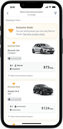
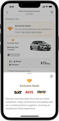
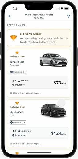
This redesign resulted in a significant increase in conversion rate, from 0.5% to 2.5%, during our A/B test.
Redesigning T&C → Better UX 🤝 5%↑ in Conversions
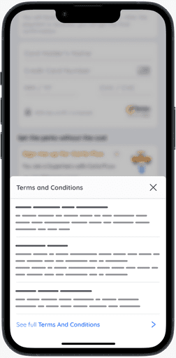
Our existing (A) terms and conditions in our checkout screen was a wall of text that seemed like it was created to make users not read it. Everybody knew it was not a good user experience to have it like that but the general ideas was that it would decrease the conversion rate if we improved it. But the increasing post-purchase dissatisfaction was pushing us to improve it even if it decreased the conversion rate.
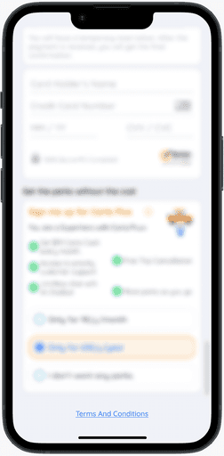
When designing variant B, I asked a lot of questions to people in different functions in our company. What was the key issues about post-purchase dissatisfaction, what was users were usually confused about and asking about.
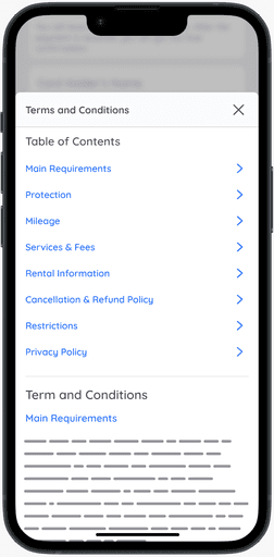
Progressive disclosure: Almost nobody likes reading legal texts so I put three key topics on the first page with summary information about them. And let users proceed to acquire more detail if they wanted to.
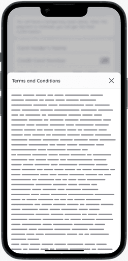
Information architecture: I took the wall of text and separated it into headings and subheadings for users to easily find what they are looking for and navigate through this complex legal text.
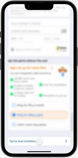
The new design (variant B) achieved a 5% increase in conversion compared to variant A.
Engaging Content Drives Sharing: 20% User Adoption Rate
Our car rental company's previous "share and get discount" feature, aimed at increasing brand awareness and app downloads, had failed to gain traction.
Without conducting formal user interviews, I sought to understand what might motivate our users to share our app on social media or with friends, even with a discount incentive.
I hypothesized that users might be reluctant to appear desperate by sharing the app just for a 10% discount. To address this, I created a social sharing feature that focused on engaging content rather than direct promotion. I developed Instagram stories about car rentals, but these were fun facts like first rental car experiences, most popular rental cars of the year, and interesting car rental facts.
To test this concept, we designed an MVP where users were encouraged to tag our company and share these stories on their Instagram accounts. Our marketing department would then send promo codes to participants. This new approach proved successful, with 20% of "Offers Page" visitors utilizing this feature during the testing period.
More About My Role
Data-Driven Design & User Research
In my current role, I focus on improving user experience and driving conversion rates through data-driven design. To achieve this, I've taken initiative in leveraging SQL, Google Analytics, and behavioral analytics tools like Hotjar and Clarity. This approach has unlocked new insights and exploration opportunities, especially valuable in our small company where access to data can be a challenge. Additionally, I conduct user interviews and surveys to gain a deeper understanding of our users' needs and behaviors.
Systemizing UI Design
A significant part of my work involves systemizing our UI design process. Our app, developed since 2012, had accumulated inconsistencies over time. I'm trying to address this by implementing a structured Figma workflow, utilizing auto-layout features, and establishing responsive design principles. This systemization does not only improve design consistency but also enhances our overall efficiency.
Improving Handoff Process
I've also refined our handoff process to better suit our agile, in-office environment. Recognizing that our previous approach lacked the necessary detail, I developed a unique handoff format that includes comprehensive notes, annotations, flowcharts, prototypes, and relevant external links.
Combined with our improved UI elements and style guide, this new process has significantly reduced back-and-forth communication and improved design archiving, leading to a more streamlined workflow.